-
Created on : 1/16/15
Auteur : AngeloUccello
Membre depuis : January 2014
Projets partagés : 5

Description du projet

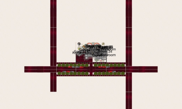
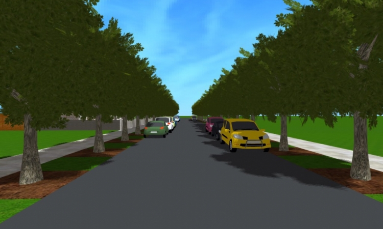
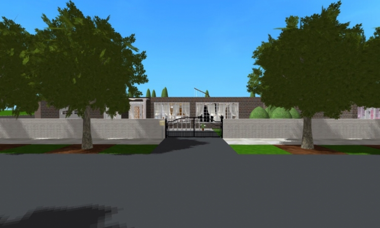
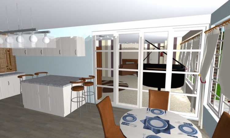
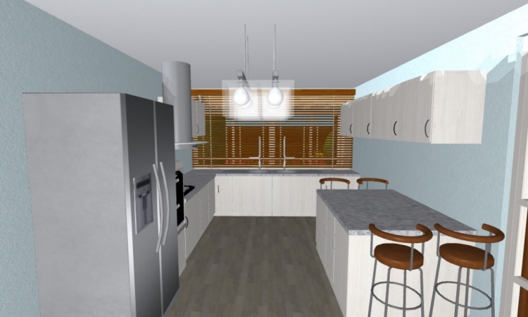
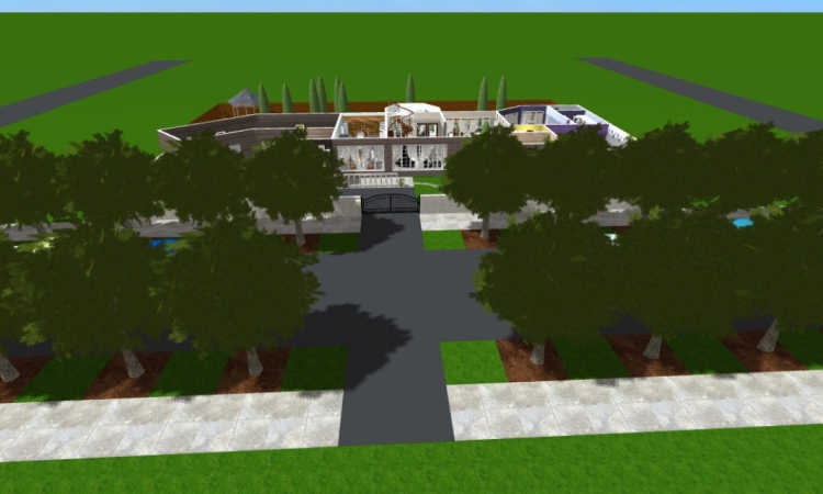
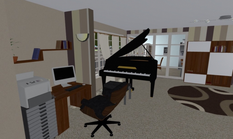
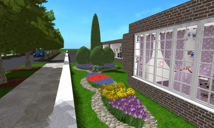
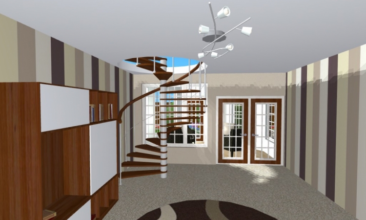
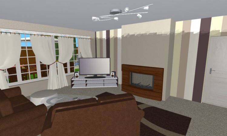
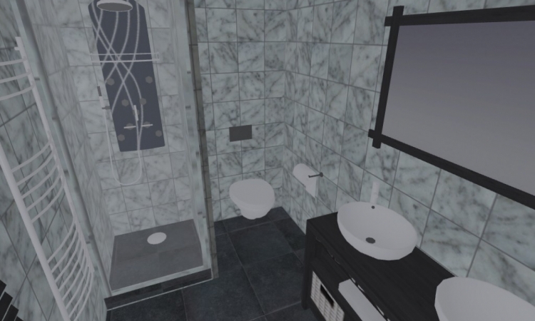
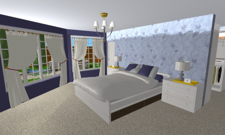
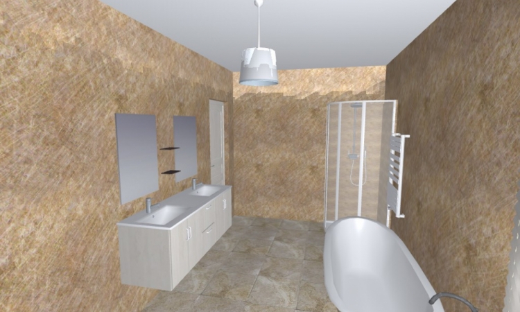
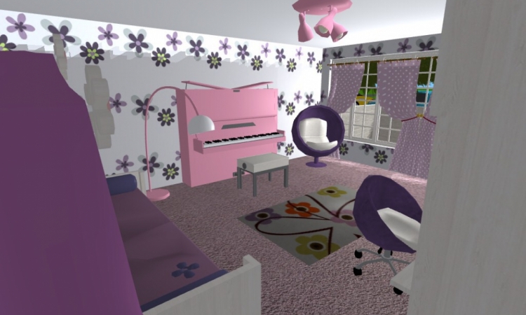
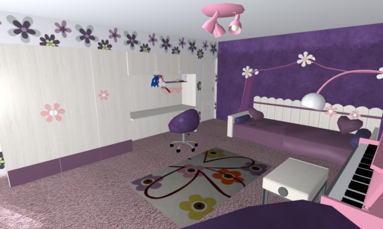
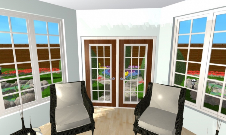
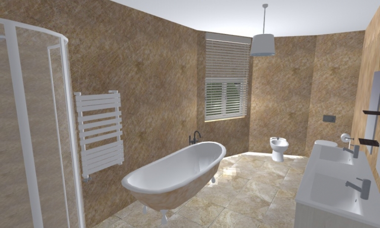
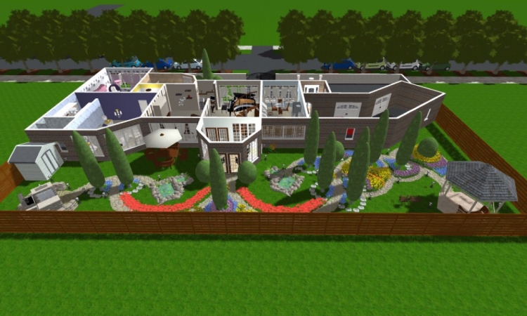
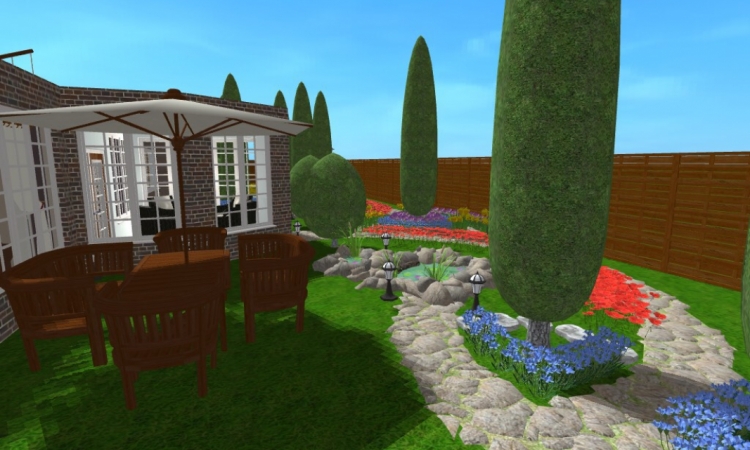
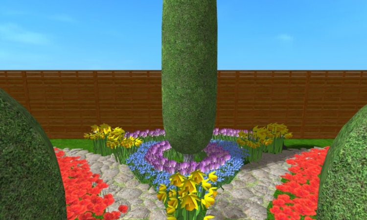
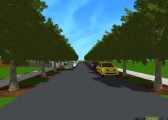
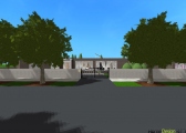
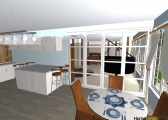
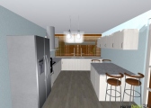
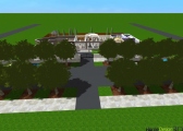
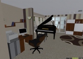
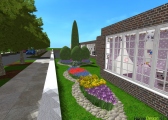
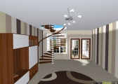
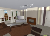
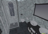
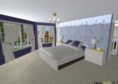
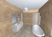
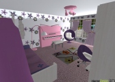
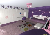
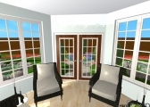
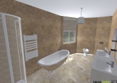
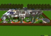
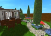
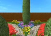
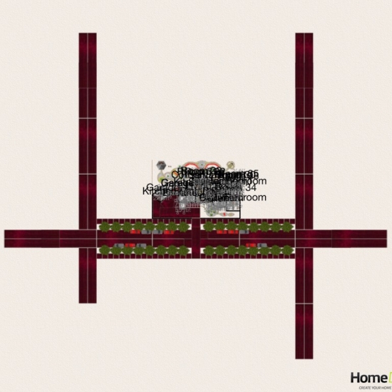
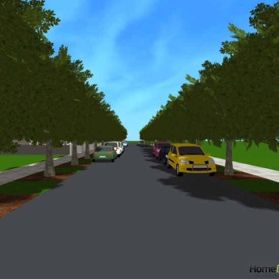
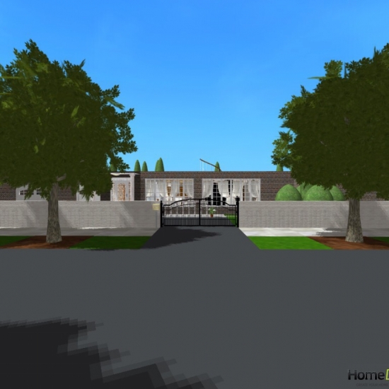
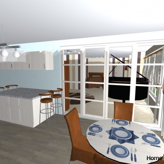
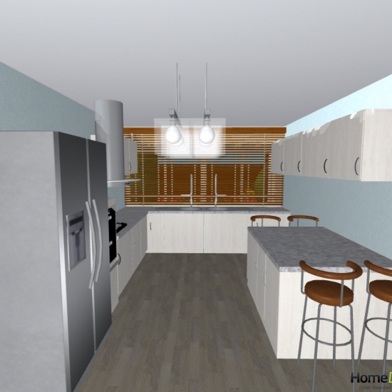
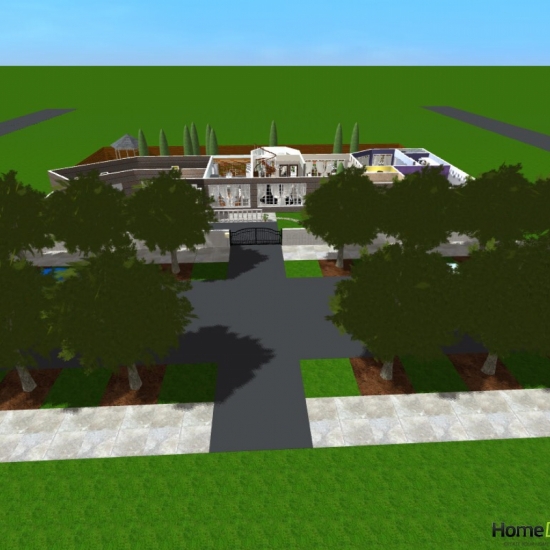
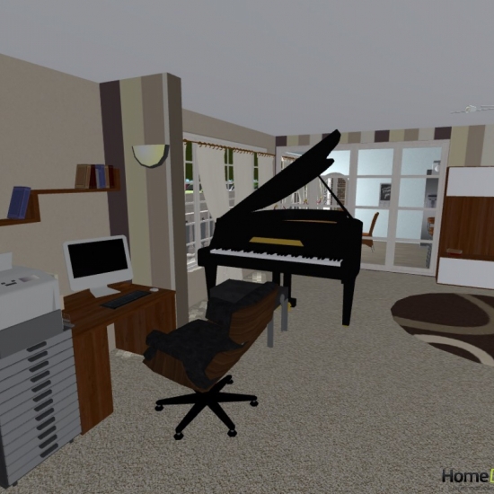
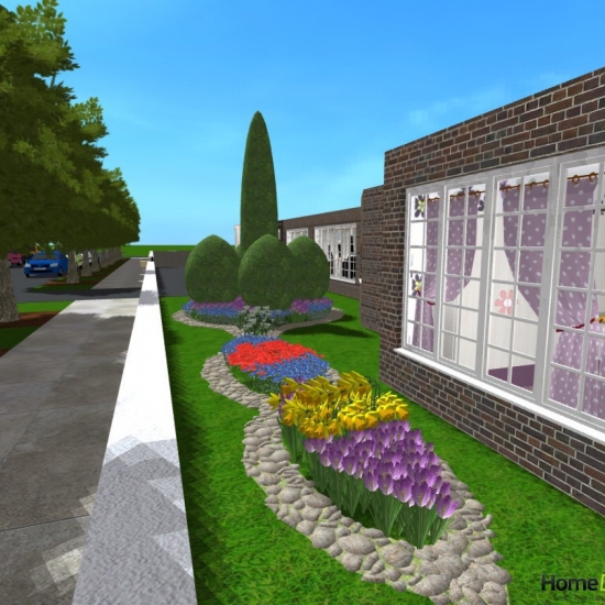
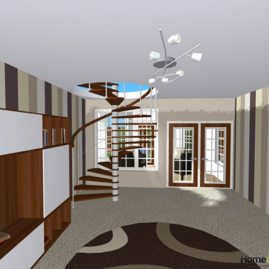
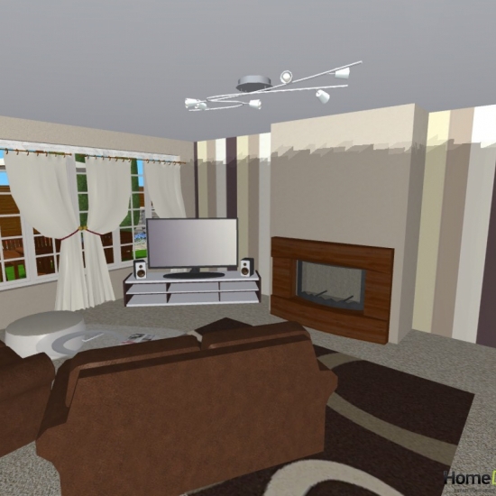
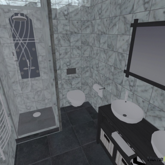
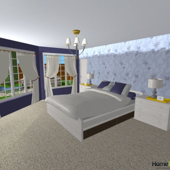
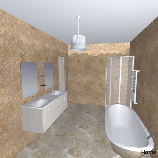
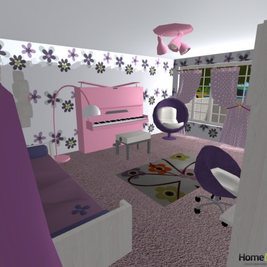
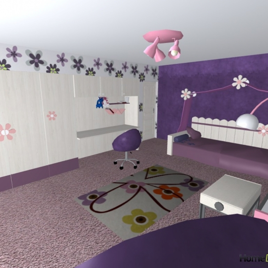
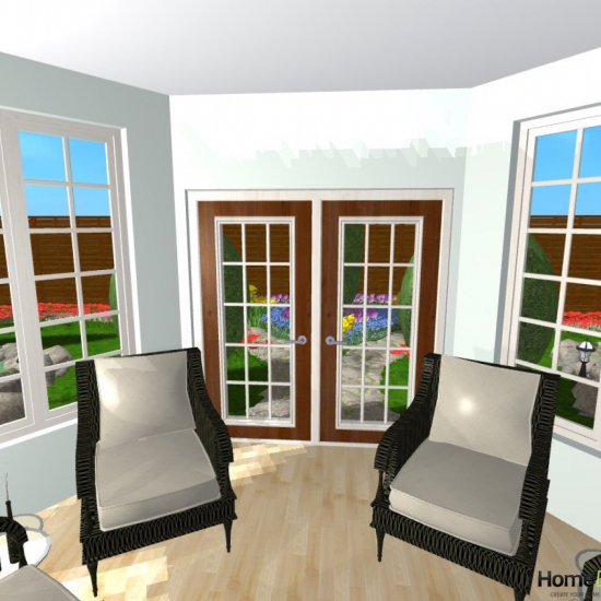
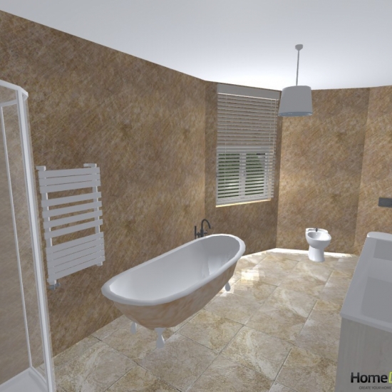
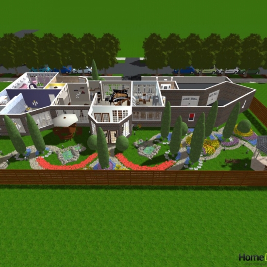
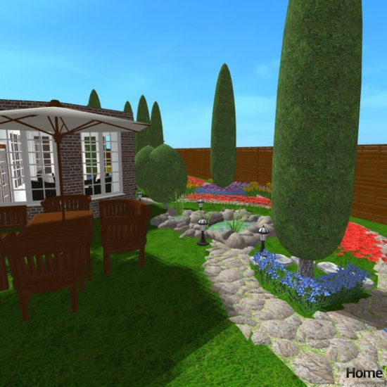
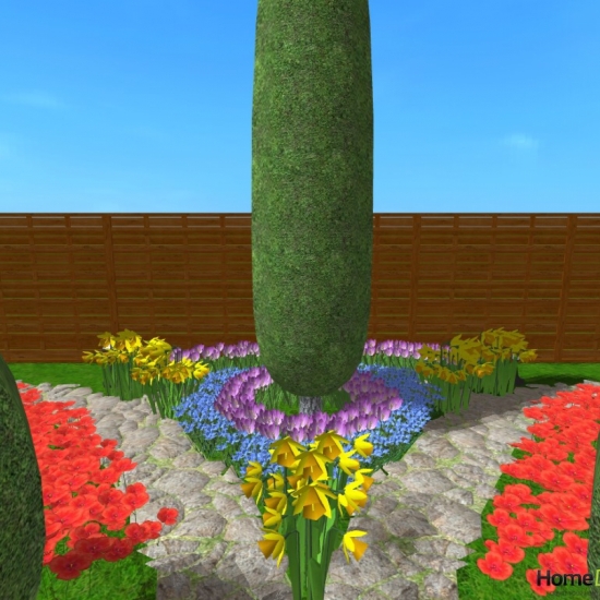
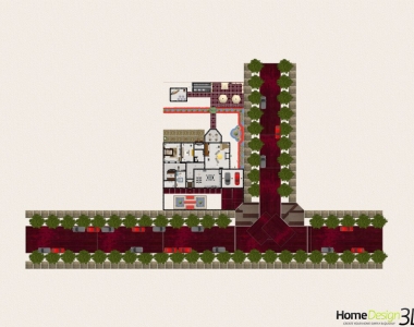
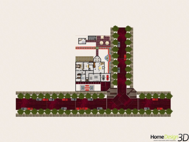
My project is more of a makeover than a fresh design, as it was based on the \"House 02\" template the app comes with, so by all means, go and check that house out and contrast it with my redesign. I extended it by nearly 1,000 sq feet, added a conservatory, back and front gardens, surrounding wall at the front, and even a street for the house to sit. I may at some point design other houses for this street as well, but for now, it\'s just the one house. Overall though, I feel I\'ve been as sagacious as possible in transforming what was a rather municipal dwelling into a more grandiloquent abode. <br><br>The entrance way to the house has been extended, and the front door moved around to the front. A porch covers the area abeam the front door held up by 2 marble columns. The inside of the entrance itself is bare brick, giving it a rustic charm. You can also get to the garage through here, which is practical as it means you don\'t have to take your shoes off to put them back on again to go into the garage through another part of the house. <br><br>The obstreperous open-plan kitchen/diner/living room has been totally transformed. Not only do the occupants now have a choice between open plan and not (we\'ll also just pretend the glass in the sliding doors is privacy glass) - but the kitchen has been extended out, with a window to the new back garden added. A breakfast bar has also been added. The colours are now much more complimentary and easy on the eye. The wooden floor of the kitchen giving way to the carpet of the living room as we pass through the sliding doors. <br><br>The living room has also been extended massively, but one of the most important changes is the aggrandisement of a spiral staircase in order to accommodate a door out to the back garden. This was a major fault in the standalone template as the only way you could get to the rear of the property from the house was to go through the garage. Another large problem I found with this property was the lack of natural light, which is something I\'ve addressed throughout. The hall is no longer an open plan part of the living room, and has been sealed away to open up the living area more. <br><br>White and yellow stripes greet in the hall. This is a small area and the effect of the stripes makes it feel less claustrophobic; although one wouldn\'t usually spend much time in this area of the property as it merely an avenue to a persons desired location. <br><br>Instead of a separate toilet and bathroom, the rooms have been amalgamated into one. A window has been added also to allow in natural lights. <br><br>The master bedroom has been extended, and transformed with a Walk-in-Wardrobe and Ensuite Bathroom. A television has been added to the room without compromising on the view of the garden. <br><br>The Ensuite bathroom has a spa shower with double variety unit, with the toilet tucked behind the wall which encompasses the shower. It may not seem like the most capacious place - but it\'s perfectly adequate for its intended uses. <br><br>I changed the second bedroom into a little girls room purely to exercise the capabilities of the app. I extended the room into the front garden to cater for the large wardrobe and floral bed. A pink piano was also added in theme with the grand piano in the living room. It seams to now be a most phantasmagorical place for a girl. <br><br>The conservatory that leads off the living room from by the spiral staircase is simple. Contemporary colour scheme and wicker chairs giving a place to enjoy the garden when the clouds would rather you stayed indoors. <br><br>The garden was pretty much made up as I went along; I had absolutely no preconceived ideas about what I wanted to do with it. In a lot of ways, it designed itself, as it all flows quite mystically from one thing to the next. There\'s a barbecue with seating area around a table, 2 ponds, a shed, gazebo, and probably a partridge in a pear tree somewhere. The garden is best just seen and ogled at. <br><br>I\'m really pleased at the overall outcome of this. I couldn\'t upload all the photos I wanted to due to the upload limitations, and unfortunately the photos are mixed up. Nevertheless, I hope everyone enjoys my design. <br>
Les autres projets
de AngeloUccello


